- Always use the whole logo as it is – do not take pieces out or deform it. Prefer primary version when it’s possible
- To maintain recognizability the clear space is important. Please use the designed clear space when possible
- Use either primary or mono version – depending where you use it. Do not replace or add colours.
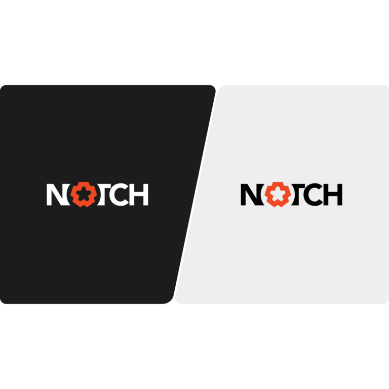
Primary Version
Use primary version of the logo whenever possible, it doesn’t matter which version you use – as long it fits the surroundings. Do not use light version on light backgrounds and vice versa. WCAG guidelines recommend a minimum contrast ratio of 4.5:1.
Mono Version
Use the monochromatic version when you don’t have option to use colours or it’s design-wise better. Do not use light version on light backgrounds and vice versa. WCAG guidelines recommend a minimum contrast ratio of 4.5:1.
